
📢 CONTACT US FOR A FREE AUDIT, CONSULTATION, OR BRAND ANALYSIS. WE WANT TO HELP HOWEVER WE CAN 🏁 BUILD YOUR BRAND, SELL THE WOW FACTOR, AND LET US DO THE THINKING AHEAD 🧠
📢 CONTACT US FOR A FREE AUDIT, CONSULTATION, OR BRAND ANALYSIS. WE WANT TO HELP HOWEVER WE CAN 🏁 BUILD YOUR BRAND, SELL THE WOW FACTOR, AND LET US DO THE THINKING AHEAD 🧠
📢 CONTACT US FOR A FREE AUDIT, CONSULTATION, OR BRAND ANALYSIS. WE WANT TO HELP HOWEVER WE CAN 🏁 BUILD YOUR BRAND, SELL THE WOW FACTOR, AND LET US DO THE THINKING AHEAD 🧠
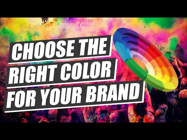
Actionable Color Psychology: A Guide to Building Your Brand
Actionable Color Psychology: A Guide to Building Your Brand
7 minutes read - Written by Nextus Team
Colors
Branding
Guide
Simple

Color isn't just a design choice; it's a powerful psychological tool and a silent conversation you're having with your audience. Think of it as your brand's first impression—the right colors can forge an immediate connection, while the wrong ones can create confusion or send an unintended message.
Understanding color psychology in branding is like learning this hidden language. It gives you the power to shape how people feel about your brand from the very first glance, turning a passive viewer into an engaged customer.
The Hidden Language of Brand Colors
Our brains are wired to react to color on a deep, subconscious level. It happens fast. In fact, research shows that up to 90% of snap judgments people make about products can be based on color alone. This initial reaction happens in seconds, long before a potential customer reads your mission statement or learns what you do.
Jargon Buster: "Snap judgment" refers to the incredibly quick, almost instant, opinion someone forms about a product or brand, often before they've consciously processed any detailed information. It's a gut reaction, and color is a primary driver of it.
Your Palette Is Your Personality
Just like people, brands have personalities. And color is one of the most effective ways to communicate it. Are you energetic and bold? Calm and reliable? Your color palette must reflect these core traits.
It's a form of visual shorthand that customers instantly understand:
Trust and Reliability: Think about why so many financial institutions and tech companies lean on the color blue. It’s a deliberate, actionable choice to communicate security and dependability.
Nature and Wellness: Health and wellness brands often choose green to evoke feelings of calm, growth, and natural well-being.
Energy and Passion: Brands that want to feel exciting or urgent—like fast-food chains or clearance sales—often use red.
Actionable Insight: Choosing a brand color isn't about picking your personal favorite. It's a strategic decision rooted in the emotional response you want to spark in your ideal customer.
This strategic thinking ensures your colors are not just seen, but truly felt. It’s how you build a memorable brand that resonates with people on an emotional level.
Struggling to translate your brand’s core values into a compelling color palette? The branding experts at Nextus can help define your brand identity and build a visual language that connects with your ideal audience. This foundational work is critical for building a brand that stands out and earns lasting loyalty.
Decoding the Emotional Spectrum of Color
Every color carries its own unique emotional weight—a set of built-in associations that can instantly shape how someone feels about your brand. Mastering this spectrum is the first practical step in using color psychology in branding. This isn't about personal preference; it's about making a strategic choice to communicate a specific personality.
Think of each color as a tool. Red can create urgency and grab attention, while a calm blue can build a foundation of trust. The skill is knowing which tool to use for the job.
Warm Colors: The Spectrum of Energy and Optimism
Warm colors like red, orange, and yellow vibrate with high energy, passion, and happiness. They’re a fantastic choice for brands that want to feel dynamic, exciting, and approachable.
Red is one of the most powerful colors you can use. It’s visceral—meaning it causes a deep, physical feeling. It triggers responses of passion, importance, and urgency. It’s no accident you see it on clearance sale signs and in the fast-food industry—it’s an actionable shortcut to encourage quick decisions. On the flip side, it can also signal danger, so it must be used carefully.
Yellow is the color of optimism, warmth, and clarity. It’s cheerful and energetic, making it a go-to for brands trying to evoke creative, accessible happiness. The downside? Its high visibility can become overwhelming or even create anxiety if overused.
Cool Colors: The Spectrum of Calm and Trust
On the other side of the wheel, cool colors like blue, green, and purple tend to have a more calming, soothing effect. These are the colors you use to communicate stability, professionalism, and serenity, making them a staple for corporate and wellness brands.
There’s a good reason blue is a dominant force in the corporate world. It is overwhelmingly linked to feelings of trust, dependability, and strength. That’s why countless financial institutions, tech giants, and healthcare providers build their identity around it. The risk is that it can come off as cold or impersonal if not balanced with warmer, more human elements.
A brand's core message can be instantly amplified—or undermined—by its primary color. To dig deeper into how design choices can pull specific emotional levers, it’s worth exploring the principles of emotional design.
Green neatly bridges the gap between the sunny energy of yellow and the quiet calm of blue. It's impossible to separate green from nature, so it immediately brings to mind feelings of growth, health, and tranquility. This makes it an obvious fit for organic products, wellness brands, and environmental causes.
Common Colors and Their Psychological Associations in Branding
To make this more actionable, here's a quick-reference table breaking down the most common emotional and industry associations for key colors. Keep in mind these are rooted in Western cultures and can vary.
Color | Common Positive Associations | Common Negative Associations | Industries That Use It |
|---|---|---|---|
Red | Passion, Energy, Urgency, Importance | Danger, Aggression, Anger | Food, Retail (Sales), Entertainment |
Blue | Trust, Stability, Calm, Professionalism | Cold, Impersonal, Aloof | Finance, Tech, Healthcare, Corporate |
Yellow | Optimism, Happiness, Warmth, Clarity | Caution, Anxiety, Cowardice | Food, Energy, Automotive |
Green | Growth, Health, Nature, Tranquility | Envy, Boredom, Blandness | Health & Wellness, Environmental, Food |
Orange | Enthusiasm, Creativity, Friendliness | Immaturity, Loudness, Frivolous | Tech, Food & Beverage, Children's Brands |
Purple | Luxury, Wisdom, Creativity, Royalty | Arrogance, Extravagance | Beauty, Luxury Goods, Wellness |
Black | Sophistication, Power, Elegance, Formality | Oppression, Sadness, Evil | Luxury, Fashion, Tech |
White | Simplicity, Cleanliness, Purity, Modernity | Sterility, Emptiness, Coldness | Healthcare, Tech, Modern Brands |
This table serves as a solid starting point, but the real magic happens when you combine these colors thoughtfully to tell a more nuanced brand story.


Choosing a color palette isn't just an aesthetic choice. It's a strategic investment in your most critical business asset: brand recognition. Our brains are wired to process and recall colors far more easily than shapes or words. This simple biological fact is the secret behind the world's most lasting brands.
Building Unforgettable Brand Recognition with Color
When a company commits to a signature color and uses it consistently, it creates a powerful mental shortcut for customers. Think about the iconic robin's-egg blue of a Tiffany & Co. box or the unmistakable red of a Coca-Cola can. You recognize the brand without seeing the name—that's the power of disciplined color consistency.
Actionable Insight: Apply your brand colors across every single touchpoint—from your website and social media to your packaging and business cards. Every interaction reinforces that connection, making you instantly stand out in a sea of competitors.
The Science Behind Signature Colors
The effect of color on memory isn't just a marketing theory; it's backed by compelling data. Research shows that sticking to a signature color can boost brand recognition by a staggering 80%. This is proof that a strong, consistent color identity is one of the fastest ways to cut through market noise.
Even more telling is how color sticks in our memory. Studies have found that 81% of people can remember a brand’s color, while only 43% can recall its name. This drives home the point that your color palette is more than decoration—it's a foundational piece of your brand's ability to be remembered.
Choosing your colors is the first step in building a powerful visual language. It’s a language that builds familiarity, and familiarity ultimately builds trust.
From Color Choice to Brand Strategy
A signature color only becomes powerful when it's part of a bigger plan. It must connect with your brand's core message, personality, and values to create an authentic and cohesive experience. To maximize your color choices, weave them into the process of developing a comprehensive brand strategy.
Your signature color acts as the visual anchor for your entire brand. It’s the thread that ties every piece of your marketing together, creating a unified and instantly recognizable presence.
This strategic mindset ensures your colors do more than look good—they work hard to build real brand equity. For businesses that want to build a memorable identity from the ground up, professional brand development services provide the solid foundation needed for long-term success.
Ultimately, a well-chosen and consistently used color palette is one of the most effective tools you have for building a brand that people won't forget.
How to Choose the Right Colors for Your Brand
Picking a brand color palette is more than an aesthetic choice. It’s a strategic process that demands deep thinking about your identity, audience, and market position. The first step is to move past personal preferences and build a brand that connects on an emotional level. You're aiming for a visual identity that feels both intentional and authentic.
This process begins with introspection. Before you think about specific shades, you need a crystal-clear understanding of your brand’s core personality. Is your brand rugged and dependable? Or innovative and daring? Your color palette must be a direct reflection of these fundamental traits.
Define Your Brand Personality
First, you must define what your brand stands for. A good way to think about this is in human terms: if your brand walked into a room, what energy would it bring? Answering that question is key to aligning your visual identity with your core message.
Before choosing colors, it's vital to establish a powerful brand positioning framework. This framework defines your brand's unique identity and its place in the market. Think of it as your strategic North Star, ensuring every decision—including color—is anchored in a solid plan.
Once you have that foundation, you can start matching personality traits to the psychological associations of different colors. A brand that wants to be seen as trustworthy will naturally lean towards blue, while one focused on luxury might explore shades of purple or black.
Analyze Your Audience and Competitors
Knowing who you are is only half the battle. You also need to know who you’re talking to and who you’re up against. Your color choices must resonate with your target audience's expectations and cultural background. A color that excites a younger crowd might feel jarring to an older one.
Equally important is a deep dive into your competition. Look at the colors your direct competitors are using. This isn't about copying them—it's about finding an opportunity to differentiate. If everyone in your industry uses blue to signal trust, perhaps a different color could help you stand out while still communicating reliability.
Actionable Insight: Your goal is to find a visual niche. Use color to carve out a unique space in the consumer's mind, making your brand instantly distinguishable from the rest.
Create and Test Your Palette
With your research complete, you can start building your palette. Most brands use a simple, effective structure:
Primary Color (60%): The dominant, most recognizable color for your brand.
Secondary Color (30%): Complements your primary hue and creates visual hierarchy.
Accent Color (10%): A contrasting color used for calls-to-action (CTAs) and other important highlights.
This 60-30-10 rule provides a balanced, professional look. For startups, getting this mix right is crucial. Research shows that up to 90% of snap judgments about products are based on color, and 85% of customers cite color as a major reason they buy.
Finally, do not skip the testing phase. Get feedback from a sample of your target audience to see if your chosen colors actually evoke the intended emotions. This one step can save you from a costly mistake. If you need help navigating this process, the expert team at Nextus can provide the strategic clarity needed to build a powerful and effective color palette.
Common Brand Color Mistakes to Avoid
Knowing what to do with color is half the battle. Knowing what not to do can save your brand from sending the wrong signals and undermining your hard work.
Even with the best intentions, a few common slip-ups can sabotage your efforts. Let's walk through the biggest pitfalls so you can steer clear of them.
One of the most frequent errors is picking colors based on personal preference. You might love vibrant orange, but if your brand is meant to feel calm and secure, you've created a massive disconnect. Your brand's colors aren't for you—they're for your audience.
Another classic mistake is using too many colors. It's tempting to create an exciting palette, but it often leads to visual chaos. A cluttered color scheme dilutes your message and makes it incredibly difficult for people to recognize and remember you.
Neglecting Accessibility and Contrast
This is a critical mistake that countless brands make: overlooking color accessibility. This is about making sure your color combinations are easy to read for everyone, including people with color vision deficiencies.
Jargon Buster: "Color accessibility" refers to the practice of designing content that is usable by people with various types of color vision impairment, such as color blindness. This often involves ensuring sufficient contrast between text and its background.
This isn't a small group. Roughly 1 in 12 men and 1 in 200 women have some form of color blindness, a significant portion of your potential audience.
Actionable Insight: Ignoring accessibility doesn't just exclude people; it harms the user experience for everyone and signals that your brand isn't inclusive. Poor contrast makes text hard to read for all users.
Thankfully, this is an easy fix. There are plenty of free online tools that can check your palette for the right contrast ratios. It's a simple, non-negotiable step to ensure your website and marketing materials are welcoming to every visitor.
Inconsistency Across Platforms
Finally, inconsistency is the quiet killer of brand recognition. Using a slightly different shade of blue on your website than on your social media profiles might seem minor, but it creates a disjointed, unprofessional experience.
This lack of uniformity can make a brand feel amateurish and less established, eroding the trust and familiarity you're trying to build.
Actionable Insight: Create a clear brand style guide. This document should lock down the exact color codes (HEX, RGB, CMYK) for your entire palette. This guarantees that no matter where your audience finds you, they get the same consistent, memorable visual experience. For more foundational advice, check out our branding tips for small businesses.
If any of these issues sound familiar, it might be time for a strategic refresh. The team at Nextus can audit your visual identity and help you build a cohesive, accessible, and powerful brand that avoids these costly errors.
Your Questions on Color Psychology Answered
Diving into color psychology always brings up practical questions. Let's tackle some of the most common ones to help you lock in a confident color strategy.
How Many Colors Should My Brand Palette Have?
When it comes to your color palette, less is almost always more. A clean, professional look is the goal.
Many designers use the 60-30-10 rule. Your primary color dominates about 60% of your visuals, a secondary color fills 30%, and an accent color provides the final 10% pop for things like buttons and links. Generally, a core palette of one to three colors is plenty to build a memorable identity without creating visual clutter.
Should My Brand Follow Current Color Trends?
Chasing trends can be tempting, but it’s a short-term game that can backfire. Trends, by their nature, fade. Your brand identity needs to last.
A smarter approach is to anchor your colors in your brand's core mission and personality. You can always incorporate trendy shades into a specific marketing campaign or a seasonal promotion. But your foundational brand colors must remain consistent to build long-term recognition.
Your core color palette is a long-term asset. It should feel just as relevant five years from now as it does today, grounding your brand's identity no matter what fads come and go.
How Important Is Cultural Context for Brand Colors?
For any brand with global aspirations, cultural context is absolutely critical. Colors carry wildly different meanings around the world, and getting it wrong can cause major miscommunications.
White: In the West, it’s the color of weddings and purity. In many parts of Asia, it's the traditional color of mourning.
Red: In China, red symbolizes luck, joy, and good fortune. But in South Africa, it’s associated with mourning, and in many Western countries, it’s a universal sign for danger.
Actionable Insight: Always research the color connotations in your target markets. It’s the only way to ensure your brand is sending the right signals everywhere you operate.
What Is the First Step to Rebranding With New Colors?
Before you pick new colors, the first step is a full-scale brand audit. You need a deep, honest understanding of how your brand is perceived right now. Analyze your audience, define your core values, and research what your competitors are doing.
The most important question to ask is why you're rebranding. Are you trying to modernize your look? Fix a perception problem? Pivot the business? Answering these strategic questions first ensures your new color palette is a calculated business decision, not just a fresh coat of paint. If you're facing this challenge, the team at Nextus can provide the strategic guidance needed for a successful rebrand.
Whether you're navigating a rebrand or building a new identity from the ground up, getting the color right is a big deal. If you're looking to create a powerful, strategic color palette that truly connects with your audience and stands the test of time, the experts at Nextus are here to help. Explore our services at https://www.nextus.solutions.

2025
What Is Search Engine Optimization? A Practical Guide to Boosting Your Website Traffic
2025
What Is Search Engine Optimization? A Practical Guide to Boosting Your Website Traffic
2025
What Is Search Engine Optimization? A Practical Guide to Boosting Your Website Traffic

2025
A Practical Guide to Digital Marketing for Local Businesses
2025
A Practical Guide to Digital Marketing for Local Businesses
2025
A Practical Guide to Digital Marketing for Local Businesses
Frequently
Frequently
Asked Questions
Questions
Asked QuestionS
What services do you offer as a branding agency?
What industries do you specialize in?
How Does Pricing Work?
Can you provide examples of your previous work?
How do you approach Client branding projects?
What's the best way to learn more or work together?
What services do you offer as a branding agency?
What industries do you specialize in?
How Does Pricing Work?
Can you provide examples of your previous work?
How do you approach Client branding projects?
What's the best way to learn more or work together?
What services do you offer as a branding agency?
What industries do you specialize in?
How Does Pricing Work?
Can you provide examples of your previous work?
How do you approach Client branding projects?
What's the best way to learn more or work together?
FREE AUDIT?