
📢 CONTACT US FOR A FREE AUDIT, CONSULTATION, OR BRAND ANALYSIS. WE WANT TO HELP HOWEVER WE CAN 🏁 BUILD YOUR BRAND, SELL THE WOW FACTOR, AND LET US DO THE THINKING AHEAD 🧠
📢 CONTACT US FOR A FREE AUDIT, CONSULTATION, OR BRAND ANALYSIS. WE WANT TO HELP HOWEVER WE CAN 🏁 BUILD YOUR BRAND, SELL THE WOW FACTOR, AND LET US DO THE THINKING AHEAD 🧠
📢 CONTACT US FOR A FREE AUDIT, CONSULTATION, OR BRAND ANALYSIS. WE WANT TO HELP HOWEVER WE CAN 🏁 BUILD YOUR BRAND, SELL THE WOW FACTOR, AND LET US DO THE THINKING AHEAD 🧠
Small Business Website Redesign: A Guide to Getting it Right
Small Business Website Redesign: A Guide to Getting it Right
8 minutes read - Written by Nextus Team
Websites
Guide
Simple
Small Business

A small business website redesign is more than a digital makeover; it's a strategic overhaul of your most important marketing asset. When done correctly, it transforms a static online brochure into a high-performance lead generation engine. This guide provides actionable insights to navigate the process, ensuring your new site doesn't just look better—it performs better.
When to Redesign Your Small Business Website
Deciding on the right time for a website redesign is a critical business decision. It's easy to adopt a "set it and forget it" mindset, but your website is a dynamic tool that must evolve with your business. A professional redesign isn't about chasing fleeting design trends; it's about re-evaluating your customer's journey, the technology powering your site, and its ability to achieve your business objectives.
The goal is to create a seamless, intuitive experience for your visitors that directly translates into measurable growth. Whether you're struggling with branding, technology, or marketing performance, a redesign is your opportunity to realign your digital presence with your business goals.
Recognizing the Warning Signs
How do you know it’s officially time for an overhaul? There are usually a few clear signs that your current site is starting to hold you back. If you find yourself nodding along to any of these, a redesign should be high on your priority list.
The most obvious red flag is poor performance. If your lead generation has flatlined or, worse, declined, your website is likely the culprit. A dip in key metrics like conversion rates or time-on-page, or a spike in your bounce rate (the percentage of visitors who leave after viewing only one page), are direct symptoms of deeper issues. It could be something as simple as a confusing navigation menu that sends frustrated users packing before they find what they need.
Another massive factor is your site's mobile experience. With over 60% of web traffic now coming from mobile devices, a clunky, hard-to-use mobile site is a conversion killer. If you’re getting feedback from customers that your site is a pain to use on their phone, you’re actively losing business.
A thoughtful small business website redesign isn't about chasing trends. It's about solving real business problems—like low lead generation or poor mobile engagement—by creating a better, more intuitive experience for your ideal customer.
Branding and Technology Misalignment
As your business grows, your brand evolves. If you've updated your mission, launched new services, or refreshed your visual identity, your website must reflect those changes. A site that looks and feels like the "old you" creates a confusing disconnect for customers and undermines your current brand positioning.
Finally, outdated technology can cripple your site's performance and your ability to manage it. We're talking about painfully slow load times, security vulnerabilities, or a clunky content management system (CMS)—the software used to manage your site's content—that makes simple updates a nightmare. A redesign is your chance to move to a modern platform, boosting speed, security, and making your life easier. If you're bogged down by these technical headaches, the expert team at Nextus can help build a new foundation that’s both powerful and simple to manage.
Auditing Your Current Site for Actionable Insights
Jumping into a small business website redesign without a clear picture of what's working—and what isn't—is like starting a road trip without a map. Before you even think about new layouts or color palettes, you must conduct a thorough audit. Your mission is to uncover the good, the bad, and the broken on your existing site to inform your strategy.
This audit isn't about finding flaws; it's about gathering hard data to make smart, strategic decisions. Every piece of information you collect becomes a building block for a website that doesn't just look better but actually performs better. You're creating a roadmap based on real user behavior, not just a gut feeling.
Digging into Your Content Performance
First, analyze your content. You need to identify which pages are your superstars and which are just taking up space.
Fire up a tool like Google Analytics and look for pages with high traffic but also a painfully high bounce rate. This is a classic sign that the content isn't meeting visitor expectations. Perhaps the headline promised something the page didn't deliver, or the information was poorly presented.
On the flip side, hunt for your "unsung heroes"—pages with low traffic but fantastic engagement. The few people who find them really stick around. These hidden gems are prime candidates for better promotion in your new design. This process helps you decide what to keep, what to improve, and what to remove entirely.
Uncovering User Behavior with UX Tools
Data tells part of the story, but visual tools show you exactly where the plot twists happen. User experience (UX) tools like heatmaps, which show where users click, move, and scroll, are invaluable. They provide a visual breakdown of user interaction on your site.
For instance, a heatmap might reveal that visitors are furiously clicking on a beautiful image that isn't a link—a clear design flaw. Or perhaps that all-important call-to-action (CTA) button you spent hours perfecting is being completely ignored.
These insights reveal the disconnects between the journey you want users to take and the one they're actually taking. It's an absolutely critical part of the process, and you can learn more about how to approach it in our guide on how to conduct user research.
An effective website audit transforms your redesign from an art project into a science experiment. You're not just changing things you dislike; you're fixing proven problems and doubling down on what already resonates with your audience.
Tackling the Technical SEO Audit
A stunning website is useless if no one can find it. A technical SEO audit uncovers invisible issues that could be tanking your search engine rankings.
Slow page speed is one of the biggest culprits. Studies show that even a one-second delay in load time can dramatically increase your bounce rate.
Use a free tool like Google's PageSpeed Insights to test your site's performance on both desktop and mobile. Your audit should also hunt for broken links (404 errors), which create a terrible user experience and signal to search engines that your site is poorly maintained. Fixing these technical gremlins is non-negotiable before a redesign. If this sounds overwhelming, the team at Nextus can handle this deep dive for you, ensuring your new site is built on a rock-solid foundation.
Sizing Up the Competition
Finally, it's time to look outside your own digital walls. Pick two or three of your direct competitors and put their websites under the microscope.
Is their navigation clearer than yours? Is their marketing message more compelling? Is their branding more modern?
The goal here isn't to copy them. It's to identify their strengths and, more importantly, their weaknesses. Every gap in their strategy is a golden opportunity for your redesigned site to shine. Maybe their blog is a ghost town, or their service pages are a wall of confusing text. This competitive analysis completes your audit, giving you a comprehensive, data-backed plan for a redesign that truly gets results.
Building Your Redesign Strategy and Goals
With your audit complete, you now have a data-backed picture of your site's strengths and weaknesses. It’s tempting to jump straight into flashy design mockups, but diving in without a solid plan is the fastest way to blow your budget and miss your goals.
This phase is about building the strategic foundation for your small business website redesign. We're defining what success actually looks like before a single pixel is placed. This is how you turn a vague wish like "I want more leads" into concrete, measurable objectives that will steer every decision moving forward.
Setting SMART Goals for Your Redesign
The most effective goals are specific, measurable, achievable, relevant, and time-bound—what we call SMART goals. This framework transforms fuzzy aspirations into real benchmarks for success. It’s the difference between just hoping for the best and engineering a specific, positive outcome for your business.
For instance, instead of saying you want a "better user experience," a SMART goal would be: "Reduce the mobile bounce rate on our main services page by 20% within three months of the new site going live." Now you have a clear target your team can design for.
Another example: Don't just say "increase online sales." Get specific: "Boost the average order value by 15% and reduce the cart abandonment rate by 10% in the next fiscal quarter." When your targets are this precise, every design choice—from button placement to the checkout flow—serves a direct business purpose.
Understanding Your Ideal Customer Through Personas
You're not redesigning your website for yourself; you're redesigning it for your customers. That’s where a user persona comes in. It’s a semi-fictional profile of your ideal customer, built from market research and real data about your existing clientele. This tool is essential for keeping your project focused on the end-user.
Creating a persona involves outlining their demographics, goals, motivations, and frustrations. For a local plumbing company, a persona might be "Homeowner Helen," a 45-year-old mom of two who, when facing a burst pipe, values reliability and transparent pricing above all else.
With Helen in mind, your design priorities become crystal clear. The new site must have a prominent "Emergency Service" button, a simple contact form, and visible customer reviews to build trust quickly. Building for a persona ensures your site is not just beautiful but genuinely useful to the people who keep your business running.
Creating the Blueprint with Sitemaps and Wireframes
Once your goals are set and you know who you're building for, it's time to map out the structure. This is where sitemaps and wireframes—the architectural blueprints for your digital storefront—come into play.
A sitemap is a high-level, hierarchical diagram showing every page on your website and how they connect. It defines the site's navigation and overall structure, ensuring a logical flow for both human visitors and search engine crawlers.
A wireframe, on the other hand, is a basic, black-and-white layout of an individual page—the skeleton. It focuses purely on the placement of key elements like headers, navigation menus, and forms, intentionally omitting colors and images to avoid distraction. This forces you to perfect the function and user journey first. It’s foundational work that can get complex, which is why our strategic team at Nextus always starts with detailed wireframing to perfect the core experience before design begins.
This visual guide shows the essential flow of a site audit, breaking it down into content, user experience (UX), and technical SEO.
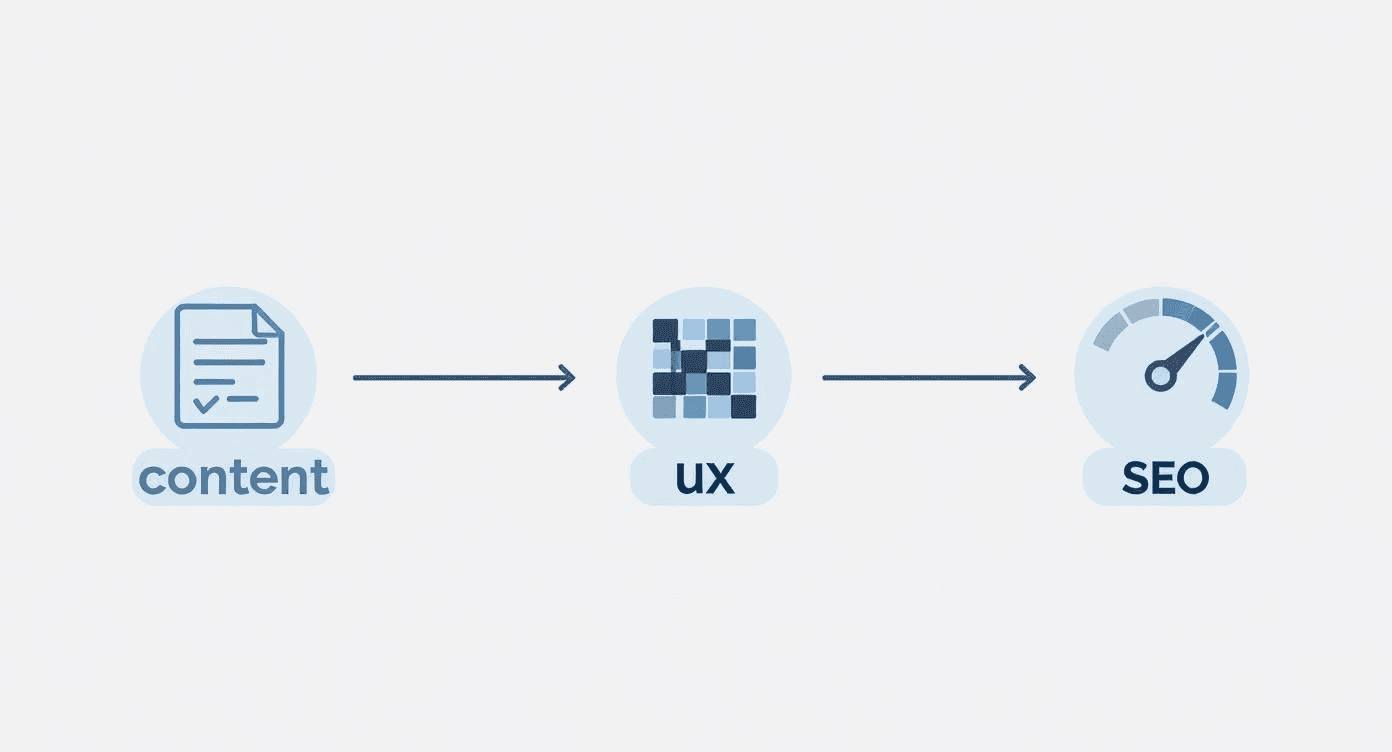
This process ensures that your strategic goals are informed by a complete picture of your site's current performance and opportunities.
Budgeting for this strategic work is a major consideration. Data shows that 25% of small businesses update their websites less than once a year, often due to cost concerns. A DIY redesign might cost anywhere from $100 to $3,000. However, for a professional, strategic project, hiring an agency typically starts in the $15,000 to $30,000 range, with more complex builds easily exceeding $75,000. To help budget effectively, you can discover more web design statistics and insights.
A small business website redesign is more than a digital makeover; it's a strategic overhaul of your most important marketing asset. When done correctly, it transforms a static online brochure into a high-performance lead generation engine. This guide provides actionable insights to navigate the process, ensuring your new site doesn't just look better—it performs better.
When to Redesign Your Small Business Website
Deciding on the right time for a website redesign is a critical business decision. It's easy to adopt a "set it and forget it" mindset, but your website is a dynamic tool that must evolve with your business. A professional redesign isn't about chasing fleeting design trends; it's about re-evaluating your customer's journey, the technology powering your site, and its ability to achieve your business objectives.
The goal is to create a seamless, intuitive experience for your visitors that directly translates into measurable growth. Whether you're struggling with branding, technology, or marketing performance, a redesign is your opportunity to realign your digital presence with your business goals.
Recognizing the Warning Signs
How do you know it’s officially time for an overhaul? There are usually a few clear signs that your current site is starting to hold you back. If you find yourself nodding along to any of these, a redesign should be high on your priority list.
The most obvious red flag is poor performance. If your lead generation has flatlined or, worse, declined, your website is likely the culprit. A dip in key metrics like conversion rates or time-on-page, or a spike in your bounce rate (the percentage of visitors who leave after viewing only one page), are direct symptoms of deeper issues. It could be something as simple as a confusing navigation menu that sends frustrated users packing before they find what they need.
Another massive factor is your site's mobile experience. With over 60% of web traffic now coming from mobile devices, a clunky, hard-to-use mobile site is a conversion killer. If you’re getting feedback from customers that your site is a pain to use on their phone, you’re actively losing business.
A thoughtful small business website redesign isn't about chasing trends. It's about solving real business problems—like low lead generation or poor mobile engagement—by creating a better, more intuitive experience for your ideal customer.
Branding and Technology Misalignment
As your business grows, your brand evolves. If you've updated your mission, launched new services, or refreshed your visual identity, your website must reflect those changes. A site that looks and feels like the "old you" creates a confusing disconnect for customers and undermines your current brand positioning.
Finally, outdated technology can cripple your site's performance and your ability to manage it. We're talking about painfully slow load times, security vulnerabilities, or a clunky content management system (CMS)—the software used to manage your site's content—that makes simple updates a nightmare. A redesign is your chance to move to a modern platform, boosting speed, security, and making your life easier. If you're bogged down by these technical headaches, the expert team at Nextus can help build a new foundation that’s both powerful and simple to manage.
Auditing Your Current Site for Actionable Insights
Jumping into a small business website redesign without a clear picture of what's working—and what isn't—is like starting a road trip without a map. Before you even think about new layouts or color palettes, you must conduct a thorough audit. Your mission is to uncover the good, the bad, and the broken on your existing site to inform your strategy.
This audit isn't about finding flaws; it's about gathering hard data to make smart, strategic decisions. Every piece of information you collect becomes a building block for a website that doesn't just look better but actually performs better. You're creating a roadmap based on real user behavior, not just a gut feeling.
Digging into Your Content Performance
First, analyze your content. You need to identify which pages are your superstars and which are just taking up space.
Fire up a tool like Google Analytics and look for pages with high traffic but also a painfully high bounce rate. This is a classic sign that the content isn't meeting visitor expectations. Perhaps the headline promised something the page didn't deliver, or the information was poorly presented.
On the flip side, hunt for your "unsung heroes"—pages with low traffic but fantastic engagement. The few people who find them really stick around. These hidden gems are prime candidates for better promotion in your new design. This process helps you decide what to keep, what to improve, and what to remove entirely.
Uncovering User Behavior with UX Tools
Data tells part of the story, but visual tools show you exactly where the plot twists happen. User experience (UX) tools like heatmaps, which show where users click, move, and scroll, are invaluable. They provide a visual breakdown of user interaction on your site.
For instance, a heatmap might reveal that visitors are furiously clicking on a beautiful image that isn't a link—a clear design flaw. Or perhaps that all-important call-to-action (CTA) button you spent hours perfecting is being completely ignored.
These insights reveal the disconnects between the journey you want users to take and the one they're actually taking. It's an absolutely critical part of the process, and you can learn more about how to approach it in our guide on how to conduct user research.
An effective website audit transforms your redesign from an art project into a science experiment. You're not just changing things you dislike; you're fixing proven problems and doubling down on what already resonates with your audience.
Tackling the Technical SEO Audit
A stunning website is useless if no one can find it. A technical SEO audit uncovers invisible issues that could be tanking your search engine rankings.
Slow page speed is one of the biggest culprits. Studies show that even a one-second delay in load time can dramatically increase your bounce rate.
Use a free tool like Google's PageSpeed Insights to test your site's performance on both desktop and mobile. Your audit should also hunt for broken links (404 errors), which create a terrible user experience and signal to search engines that your site is poorly maintained. Fixing these technical gremlins is non-negotiable before a redesign. If this sounds overwhelming, the team at Nextus can handle this deep dive for you, ensuring your new site is built on a rock-solid foundation.
Sizing Up the Competition
Finally, it's time to look outside your own digital walls. Pick two or three of your direct competitors and put their websites under the microscope.
Is their navigation clearer than yours? Is their marketing message more compelling? Is their branding more modern?
The goal here isn't to copy them. It's to identify their strengths and, more importantly, their weaknesses. Every gap in their strategy is a golden opportunity for your redesigned site to shine. Maybe their blog is a ghost town, or their service pages are a wall of confusing text. This competitive analysis completes your audit, giving you a comprehensive, data-backed plan for a redesign that truly gets results.
Building Your Redesign Strategy and Goals
With your audit complete, you now have a data-backed picture of your site's strengths and weaknesses. It’s tempting to jump straight into flashy design mockups, but diving in without a solid plan is the fastest way to blow your budget and miss your goals.
This phase is about building the strategic foundation for your small business website redesign. We're defining what success actually looks like before a single pixel is placed. This is how you turn a vague wish like "I want more leads" into concrete, measurable objectives that will steer every decision moving forward.
Setting SMART Goals for Your Redesign
The most effective goals are specific, measurable, achievable, relevant, and time-bound—what we call SMART goals. This framework transforms fuzzy aspirations into real benchmarks for success. It’s the difference between just hoping for the best and engineering a specific, positive outcome for your business.
For instance, instead of saying you want a "better user experience," a SMART goal would be: "Reduce the mobile bounce rate on our main services page by 20% within three months of the new site going live." Now you have a clear target your team can design for.
Another example: Don't just say "increase online sales." Get specific: "Boost the average order value by 15% and reduce the cart abandonment rate by 10% in the next fiscal quarter." When your targets are this precise, every design choice—from button placement to the checkout flow—serves a direct business purpose.
Understanding Your Ideal Customer Through Personas
You're not redesigning your website for yourself; you're redesigning it for your customers. That’s where a user persona comes in. It’s a semi-fictional profile of your ideal customer, built from market research and real data about your existing clientele. This tool is essential for keeping your project focused on the end-user.
Creating a persona involves outlining their demographics, goals, motivations, and frustrations. For a local plumbing company, a persona might be "Homeowner Helen," a 45-year-old mom of two who, when facing a burst pipe, values reliability and transparent pricing above all else.
With Helen in mind, your design priorities become crystal clear. The new site must have a prominent "Emergency Service" button, a simple contact form, and visible customer reviews to build trust quickly. Building for a persona ensures your site is not just beautiful but genuinely useful to the people who keep your business running.
Creating the Blueprint with Sitemaps and Wireframes
Once your goals are set and you know who you're building for, it's time to map out the structure. This is where sitemaps and wireframes—the architectural blueprints for your digital storefront—come into play.
A sitemap is a high-level, hierarchical diagram showing every page on your website and how they connect. It defines the site's navigation and overall structure, ensuring a logical flow for both human visitors and search engine crawlers.
A wireframe, on the other hand, is a basic, black-and-white layout of an individual page—the skeleton. It focuses purely on the placement of key elements like headers, navigation menus, and forms, intentionally omitting colors and images to avoid distraction. This forces you to perfect the function and user journey first. It’s foundational work that can get complex, which is why our strategic team at Nextus always starts with detailed wireframing to perfect the core experience before design begins.
This visual guide shows the essential flow of a site audit, breaking it down into content, user experience (UX), and technical SEO.
This process ensures that your strategic goals are informed by a complete picture of your site's current performance and opportunities.
Budgeting for this strategic work is a major consideration. Data shows that 25% of small businesses update their websites less than once a year, often due to cost concerns. A DIY redesign might cost anywhere from $100 to $3,000. However, for a professional, strategic project, hiring an agency typically starts in the $15,000 to $30,000 range, with more complex builds easily exceeding $75,000. To help budget effectively, you can discover more web design statistics and insights.


Designing for User Experience and Conversions
A beautiful website that doesn't convert is just an expensive art project. Once your strategy is locked in, the focus must shift to creating an experience that is so intuitive it actively guides visitors toward your goals—whether that's filling out a form, buying a product, or making a call.
This is where user experience (UX) design becomes your most powerful tool in a small business website redesign. It's not about flashy animations; it's about psychology. Understanding how people see, read, and interact with a web page allows you to make their journey seamless and persuasive. Every element, from the navigation bar to the color of a "Buy Now" button, has a job to do.
Guiding The Eye With Visual Hierarchy
A foundational principle in UX is visual hierarchy—the art of arranging elements on a page to show what’s most important. Your most critical message, like your unique value proposition or the main call-to-action, must grab a visitor's attention instantly.
This is achieved using size, color, contrast, and placement. A big, bold headline will always get more attention than a small block of text. A bright orange "Get a Quote" button pops against a neutral background, screaming "Click me!" White space, the empty area around elements, is also crucial for cutting through clutter and directing the user's focus.
Crafting Clear Navigation And Compelling CTAs
If visitors can't find what they're looking for, they leave. It’s that simple. Your navigation menu must be logical, clean, and use language your customers would use. Ditch clever industry jargon for straightforward terms like "Services," "About Us," and "Contact."
Equally important are your calls-to-action (CTAs). These are the buttons and links that tell people what to do next. Weak, vague CTAs like "Click Here" or "Submit" are conversion killers. Use strong, action-oriented language that spells out the benefit, such as "Download Your Free Guide" or "Schedule a Free Consultation."
A website redesign is the perfect time to completely rethink how you guide users. I've seen small tweaks, like changing a button's text from "Learn More" to "See Pricing," have a massive impact on conversion rates because it sets a much clearer expectation for the user.
Key User Experience Elements and Their Impact on Conversions
Poor user experience drives many redesigns. In fact, some data shows that 61.5% of all redesigns are initiated because bad UX was actively hurting the business. For instance, by decluttering pages and improving its CTAs, one company boosted its enquiry form submissions by 201%.
Understanding the direct link between user-friendly design and business outcomes is crucial. The table below breaks down key UX elements and their impact on your bottom line.
UX Element | What It Means | Positive Impact (Good UX) | Negative Impact (Bad UX) |
|---|---|---|---|
Intuitive Navigation | A logical, easy-to-follow site menu and structure. | Users find information quickly, leading to lower bounce rates and higher engagement. | Visitors get frustrated and leave, increasing bounce rates and losing potential leads. |
Clear CTAs | Action-oriented buttons that tell users exactly what to do. | Higher click-through rates and more conversions (e.g., form fills, sales). | User confusion and inaction, leading to abandoned journeys and lost opportunities. |
Mobile Responsiveness | The site looks and works perfectly on all devices (phone, tablet, desktop). | Captures the 50%+ of traffic from mobile, providing a seamless experience for all users. | Alienates mobile users, leading to high bounce rates and damage to brand perception. |
Page Load Speed | How quickly your website's content appears for a visitor. | Users stay engaged; a 1-second delay can hurt conversions by 7%. | High abandonment rates; visitors won't wait for slow pages to load. |
Readability | Clean fonts, good contrast, and scannable text (short paragraphs, headings). | Visitors can easily digest your message, increasing time on page and comprehension. | Eye strain and frustration cause users to skim or leave without understanding your value. |
These are not just "nice-to-have" design features; they are core business drivers that can make or break your online success.
Simplifying Forms And Checkout Processes
Friction is the enemy of conversion. Nowhere is this more obvious than in your contact forms and checkout processes. Every unnecessary field you ask someone to fill out is another opportunity for them to give up and leave.
Review your forms with a critical eye. Do you really need their phone number on the initial contact form? Can you streamline a multi-step checkout into one smooth page? These simplifications drastically reduce user effort and can lead to a huge jump in completed forms and sales.
For those looking to go deeper, our team at Nextus put together a detailed guide covering conversion rate optimization best practices. Once your design is locked in, you can start layering in proven strategies, like understanding key conversion rate optimization best practices for the modern web. This is where an experienced team can turn a good design into a great one that actually delivers results.
Protecting Your SEO in a Website Redesign
It’s the nightmare scenario for any small business owner: you launch a stunning new website, and your search traffic immediately falls off a cliff. A small business website redesign requires a rock-solid technical game plan to protect—and ideally improve—the search engine rankings you’ve worked so hard to earn. Neglecting SEO during a redesign is like building a beautiful new store but forgetting to install doors.
The goal is to attract more of the right customers, not lose the ones who already find you on Google. This means every decision, from your site’s new structure to how you handle old pages, must be viewed through an SEO lens. With strategic planning, you can avoid common disasters and ensure your new website is a clear win for your online visibility.
The Mobile-First Imperative
Designing for a desktop and then trying to cram it onto a mobile screen is an outdated approach. The modern standard is mobile-first design, which means the mobile version is your primary focus, not an afterthought. This isn’t just a trend; it’s a direct response to how people use the internet and how search engines now rank websites.
This one factor drives a huge number of redesigns. Over 60% of all web traffic now comes from mobile devices, so delivering fast, intuitive experiences on smaller screens is paramount. In fact, 57% of internet users admit they won't recommend a business if its mobile website is clunky or hard to use. You can get a better feel for these user behaviors by checking out more small business website statistics and insights.
Preserving Authority with 301 Redirects
One of the most catastrophic mistakes is changing page URLs without telling search engines where the old content moved. A 301 redirect is a permanent instruction that tells search engines a page has a new home. This is not just a suggestion; it's a critical command that passes most of the page's ranking authority (what SEO professionals call "link equity") to the new URL.
You must meticulously map every single old URL to its new counterpart. Forgetting this is like deleting a high-ranking page and starting over from scratch, which can be devastating for your traffic.
A website migration without a comprehensive 301 redirect map is like throwing away years of SEO work. Every single important page URL must be accounted for to preserve your search rankings and prevent a frustrating experience for users hitting dead "404 Not Found" pages.
Optimizing for Speed and Crawlability
Your new site might look incredible, but if it’s slow, both visitors and Google will penalize it. Page speed is a confirmed ranking factor. During your redesign, focus on compressing images, simplifying code (also known as minifying CSS and JavaScript), and choosing a reliable hosting provider to ensure your pages load in under three seconds.
Equally important is ensuring search engines can easily understand your new site’s layout—a concept known as crawlability. Creating a clean, logical site structure and submitting an updated XML sitemap to Google helps its bots discover and index all your important new pages much faster. This part can feel technical, but it's a non-negotiable step. Our complete SEO checklist for a new website is a great resource. Juggling these details is a lot, and a specialized team like Nextus can manage the entire migration process to keep your SEO safe.
Your Relaunch Checklist for a Smooth Transition
A successful launch day for your small business website redesign doesn't just happen. It’s the result of careful planning and a meticulous pre-flight check. This is where you iron out every last detail, ensuring the switch from your old site to the new one is seamless for both your visitors and search engines. Think of it as the final dress rehearsal before opening night; your job is to catch any potential glitches before your customers do.
Pre-Launch Testing and Verification
Before you push that big red button, it's time for serious testing. Load the new site on different web browsers—Chrome, Firefox, Safari. More importantly, test it on a range of devices: an iPhone, an Android, a tablet, and a desktop to confirm the responsive design is working perfectly everywhere.
Now, click every single link. Fill out every single contact form. Test your marketing automations—did the right email fire? For businesses using tools like n8n or Zapier to connect their website to other systems, this is a critical step. A broken form or faulty automation on launch day is a lead generation nightmare waiting to happen.
The hours you spend testing before launch are infinitely more valuable than the hours you'll spend on damage control after. A single broken link or a non-functioning form can immediately erode the trust you've just tried to build with your new design.
Securing Your Data and Analytics
One of the most common—and costly—launch mistakes is losing your analytics data. Before going live, double-check that your tracking codes for tools like Google Analytics are installed correctly on every single page of the new site. This is non-negotiable if you want a continuous stream of data without any gaps.
You also need to verify your new site with Google Search Console. This is a critical step for monitoring your site's health and SEO performance post-launch. For a deep dive into every detail, this ultimate website launch checklist is a fantastic resource. Managing these technical odds and ends can feel tedious, which is why our team at Nextus handles this entire process to guarantee a flawless transition.
Post-Launch Monitoring and Promotion
Once your new site is live, the work isn't over. Your first few days should be spent actively monitoring for any issues. Keep a close eye on your site for any 404 "page not found" errors that might have slipped through the cracks. This is also the perfect time to submit your new XML sitemap to Google Search Console to give it a nudge for faster indexing.
Finally, don't forget to celebrate and get the word out! Announce the launch across your social media channels, send a notification to your email list, and start tracking your key performance indicators (KPIs) against the SMART goals you set in the planning phase. This is how you'll measure the true success and ROI of your redesign.
Answering Your Top Website Redesign Questions
Thinking about a small business website redesign always stirs up a few key questions. It’s a big investment, and you want to know what you’re getting into. Here are the honest answers to the questions we hear most often from business owners.
What's This Going to Cost Me?
There’s a huge range here, depending on your needs. A DIY approach using a template builder might cost anywhere from a few hundred to a couple of thousand dollars.
However, for a professional, strategy-first redesign that actually drives growth, you're looking at a different level of investment. A project that includes custom design, smart development, and foundational SEO typically starts around $15,000 and can go up to $75,000 or more, depending on the project's complexity.
How Long Does a Redesign Take?
Patience is key. A proper redesign isn't an overnight job. From our first strategy call to launching the new site, a typical project takes between 8 and 16 weeks.
This timeline can shift based on your site's size, the complexity of features you need, and how quickly you provide feedback and content. A simple brochure site will be on the faster end, while a complex e-commerce or custom web application will naturally take more time.
Will My SEO Rankings Tank During a Redesign?
This is a valid fear. A poorly managed redesign can cause a temporary dip in traffic, but it’s 100% preventable with a solid technical SEO plan from day one.
This means meticulously mapping every single 301 redirect, obsessing over page speed, and building for mobile-first. To ensure all your bases are covered, you can run through our detailed SEO checklist for a new website.
A great redesign should boost your SEO, not hurt it. You’re cleaning up old code, fixing technical glitches, and creating a far better user experience—all things Google loves to see.
Can I Update the Website Myself Afterwards?
Absolutely. The goal is to empower you, not to make you dependent on a developer for every little change. We build our sites on easy-to-use Content Management Systems (CMS) like WordPress or Shopify.
This means you’ll be able to add new blog posts, swap out photos, or update text on your own. Here at Nextus, we always include training so our clients feel totally comfortable and in control of their new online home.
Ready to see what a professional redesign can do for your business? Nextus Digital Solutions builds high-converting websites that don't just look good—they get results. Schedule a free consultation today and let's talk about your project.

2025
What Is Search Engine Optimization? A Practical Guide to Boosting Your Website Traffic
2025
What Is Search Engine Optimization? A Practical Guide to Boosting Your Website Traffic
2025
What Is Search Engine Optimization? A Practical Guide to Boosting Your Website Traffic

2025
A Practical Guide to Digital Marketing for Local Businesses
2025
A Practical Guide to Digital Marketing for Local Businesses
2025
A Practical Guide to Digital Marketing for Local Businesses
Frequently
Frequently
Asked Questions
Questions
Asked QuestionS
What services do you offer as a branding agency?
What industries do you specialize in?
How Does Pricing Work?
Can you provide examples of your previous work?
How do you approach Client branding projects?
What's the best way to learn more or work together?
What services do you offer as a branding agency?
What industries do you specialize in?
How Does Pricing Work?
Can you provide examples of your previous work?
How do you approach Client branding projects?
What's the best way to learn more or work together?
What services do you offer as a branding agency?
What industries do you specialize in?
How Does Pricing Work?
Can you provide examples of your previous work?
How do you approach Client branding projects?
What's the best way to learn more or work together?
FREE AUDIT?