
📢 CONTACT US FOR A FREE AUDIT, CONSULTATION, OR BRAND ANALYSIS. WE WANT TO HELP HOWEVER WE CAN 🏁 BUILD YOUR BRAND, SELL THE WOW FACTOR, AND LET US DO THE THINKING AHEAD 🧠
📢 CONTACT US FOR A FREE AUDIT, CONSULTATION, OR BRAND ANALYSIS. WE WANT TO HELP HOWEVER WE CAN 🏁 BUILD YOUR BRAND, SELL THE WOW FACTOR, AND LET US DO THE THINKING AHEAD 🧠
📢 CONTACT US FOR A FREE AUDIT, CONSULTATION, OR BRAND ANALYSIS. WE WANT TO HELP HOWEVER WE CAN 🏁 BUILD YOUR BRAND, SELL THE WOW FACTOR, AND LET US DO THE THINKING AHEAD 🧠
Wireframes in Web Design: The Ultimate Guide to Planning Your Site
Wireframes in Web Design: The Ultimate Guide to Planning Your Site
8 minutes read - Written by Nextus Team
Websites
Guide
SEO
Branding

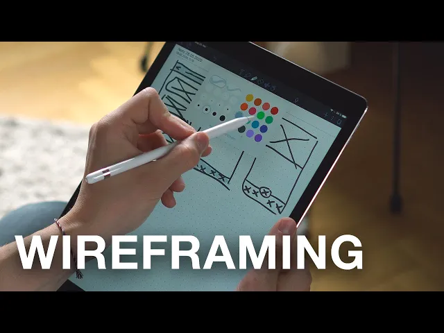
Ever wonder how a great website gets its start? It's not with a fancy color palette or a cool font. Before a single line of code is written, every successful website begins with a solid plan. That plan is called a wireframe.
Think of a wireframe as the architectural blueprint for your website. It’s a simple, low-fidelity visual guide that maps out the fundamental structure and functionality of every page. "Low-fidelity" simply means it's basic, focusing purely on layout, user flow, and where content will go, intentionally leaving out distracting design elements like colors, fonts, and images. The goal is to focus on the core framework, ensuring your website is built on a solid foundation before any creative work begins.
Understanding the Role of a Wireframe in Web Design
You wouldn't start building a house without a detailed floor plan, right? The same logic applies to web design. A wireframe is that crucial first step that ensures everyone, from stakeholders to developers, is on the same page from the very beginning.
The whole point is to establish the website's core structure and map out the user's journey. By stripping away all the visual flair, the wireframe forces the team to concentrate on usability and information hierarchy. It helps answer critical questions like, "Where should the navigation menu go?" or "What's the most important call-to-action on this page?" This strategic planning is the first step toward a website that not only looks good but performs brilliantly.
Why Structure Comes Before Style
This "structure first" approach isn't new; it has deep roots in design and development history. Wireframing has evolved alongside software development methodologies since the 1970s. Early processes were rigid and sequential, but the introduction of paper prototyping in 1985 and the use of tools like Microsoft PowerPoint in 1987 signaled a shift toward more flexible planning. The release of the Agile Manifesto in 2001 really cemented the value of iterative design—a principle that wireframing embodies perfectly.
A wireframe acts as the single source of truth for a project. It creates a common language between designers, developers, and clients, turning abstract ideas into a tangible plan that prevents misunderstandings and costly revisions later on.
Wireframing is a foundational practice in the broader field of user experience (UX) design, which is all about creating intuitive and effective digital products. To get the full picture, understanding what is user experience design is key to a product’s success. If your team is struggling to align on the structural details of a new website, the experts at Nextus can step in to provide clarity and build a strong foundation, ensuring the final product is not just beautiful, but also incredibly functional.
Wireframe vs Mockup vs Prototype
To really nail down what a wireframe is, it helps to see how it fits in with the other stages of the design process. People often mix up wireframes, mockups, and prototypes, but each serves a very different purpose. "Fidelity" in this context refers to the level of detail and realism.
Think of it as a progression from a simple sketch to a fully interactive model. Here’s a quick breakdown:
Wireframe (Low Fidelity): This is the skeleton. It focuses exclusively on structure, layout, and user flow, using placeholders, boxes, and basic text.
Mockup (Medium-High Fidelity): This adds the skin—the visual design and branding. It introduces colors, typography, and actual images to show what the final site will look like.
Prototype (High Fidelity): This brings the mockup to life with interactivity. It includes clickable links and animations, allowing for user testing and demonstrating how the website functions.
So, a wireframe is the skeleton. A mockup adds the visual look and feel. And a prototype brings it to life with clickable elements, showing how it all works. Each step builds on the last, moving from a basic idea to a functional preview.
Why Wireframing Is Your Project's Most Valuable Step
Okay, we’ve covered what a wireframe is. Now, let’s get into the actionable reasons why it's the one step you absolutely cannot skip in a web project.
Think of it as a strategic investment. Spending a little time on a wireframe now saves you an enormous amount of time, money, and headaches later on. Skipping it is like telling a construction crew to build a house without a blueprint—you're just asking for chaos.
The biggest win? A wireframe forces you to establish a clear and logical information hierarchy. "Information hierarchy" is just a fancy term for organizing content in a way that is intuitive for the user. By stripping away all the visual distractions, you have to decide what's most important on each page. This simple act ensures visitors can find what they need intuitively, which is the cornerstone of a great user experience (UX).
Aligning Teams and Saving Resources
One of the toughest parts of any web project is getting everyone on the same page. Designers, developers, marketers, and clients all have different ideas in their heads.
A wireframe cuts through the confusion and becomes the single source of truth. It takes abstract concepts and turns them into a concrete visual plan that everyone can see, touch, and agree on.
This alignment is a massive money-saver. It's so much easier (and cheaper) to move a box on a simple diagram than it is to recode an entire section of a website that’s already been built. In fact, some studies show that fixing an error after development can cost 100 times more than fixing it during the design phase.
A solid wireframe catches those potential problems early when the cost of a change is practically zero. It’s exactly why we use wireframing as a core collaborative tool here at Nextus—it keeps projects on track and ensures the final product actually meets business goals from day one.
Wireframing separates the discussion of structure from the discussion of visual design. This allows you to get stakeholder buy-in on the core functionality before investing a single minute into colors or fonts.
Fostering Early Feedback and Iteration
Wireframes are also incredible tools for getting honest feedback, early and often. Because they're just simple, low-fidelity sketches, people feel more comfortable speaking up and suggesting changes.
If you show a client a beautifully polished, full-color mockup, they might hesitate to critique it because it looks "finished." They don't want to hurt your feelings or derail what seems like a completed design.
The raw, stripped-back nature of a wireframe invites constructive criticism focused purely on function and flow. This kicks off an iterative process—a cycle of feedback and refinement—allowing for quick adjustments based on real feedback. It guarantees the final design is built on a solid, user-tested foundation.
Weaving wireframing into your process is a key part of effective project planning and aligns with broader app design best practices. If you want to dive deeper into this strategic side of things, check out our guide on effective web page planning. It'll give you actionable steps for mapping out your site's structure to build something that's not just pretty, but powerful.
Deconstructing the Key Elements of a Wireframe
At first glance, a wireframe might just look like a jumble of gray boxes and plain text. But don't be fooled—every single line has a strategic purpose.
Getting a handle on these basic building blocks is the key to providing good feedback. It's how you ensure your future website is built on solid ground, not just guesswork. Think of these elements as the anatomy of a webpage; each one is vital for guiding users where they need to go.
Layout Structure and Spacing
The very first thing you'll notice is the overall layout and spacing. This is the grid system, the invisible skeleton that holds everything together and brings a sense of order to the page. It decides where the big pieces—like headers, footers, and content areas—will live.
This structure isn't just about looking tidy; it's about creating a visual rhythm that users can instinctively follow. A well-organized layout helps people know where to look for information, which is a huge win for usability. Even the empty "white space" is doing a job, preventing the page from feeling cluttered and overwhelming.
Content and Feature Placeholders
Wireframes keep things simple on purpose. Instead of final photos and perfectly crafted text, you'll see content placeholders. These are usually just boxes with an 'X' to mark an image or blocks of generic "lorem ipsum" text.
Their job is to show where different types of content will go and roughly how much room they'll need. This forces everyone to think about content strategy from day one, planning for headlines, body copy, videos, and testimonials without getting bogged down by the final visuals. It's all about answering the big question: "What needs to be on this page, and what's most important?"
A wireframe’s real power is in defining what will be on a page and where it will live, long before you decide how it will look. This strategic separation of structure from style is what makes the process so effective.
Navigation and User Flow
So, how do people get from point A to point B? That's where navigation systems come in. Wireframes map out every piece of the navigational puzzle: the main menu, any dropdowns, breadcrumb trails, and footer links. This is ground zero for building a site structure that actually makes sense.
The goal here is simple: make the user's journey feel effortless. A confusing navigation is one of the fastest ways to lose a visitor. By locking down these pathways in the wireframe stage, we make sure the final site feels intuitive right from the start. If you want to dive deeper into this, check out our guide on what is information architecture.
Calls to Action
Last but not least, every page needs a purpose. This is usually driven by the calls to action (CTAs). A "call to action" is an instruction to the audience designed to provoke an immediate response. In a wireframe, you'll see these marked as buttons or linked text designed to get a user to do something specific, like "Sign Up," "Learn More," or "Add to Cart."
Where you put these CTAs is a critical business decision. A wireframe helps pinpoint the most effective spots to place them for the best chance of conversion. At Nextus, getting the structure and placement of these key elements right is something we obsess over, ensuring our clients' websites don't just look good, but actually deliver results.
Ever wonder how a great website gets its start? It's not with a fancy color palette or a cool font. Before a single line of code is written, every successful website begins with a solid plan. That plan is called a wireframe.
Think of a wireframe as the architectural blueprint for your website. It’s a simple, low-fidelity visual guide that maps out the fundamental structure and functionality of every page. "Low-fidelity" simply means it's basic, focusing purely on layout, user flow, and where content will go, intentionally leaving out distracting design elements like colors, fonts, and images. The goal is to focus on the core framework, ensuring your website is built on a solid foundation before any creative work begins.
Understanding the Role of a Wireframe in Web Design
You wouldn't start building a house without a detailed floor plan, right? The same logic applies to web design. A wireframe is that crucial first step that ensures everyone, from stakeholders to developers, is on the same page from the very beginning.
The whole point is to establish the website's core structure and map out the user's journey. By stripping away all the visual flair, the wireframe forces the team to concentrate on usability and information hierarchy. It helps answer critical questions like, "Where should the navigation menu go?" or "What's the most important call-to-action on this page?" This strategic planning is the first step toward a website that not only looks good but performs brilliantly.
Why Structure Comes Before Style
This "structure first" approach isn't new; it has deep roots in design and development history. Wireframing has evolved alongside software development methodologies since the 1970s. Early processes were rigid and sequential, but the introduction of paper prototyping in 1985 and the use of tools like Microsoft PowerPoint in 1987 signaled a shift toward more flexible planning. The release of the Agile Manifesto in 2001 really cemented the value of iterative design—a principle that wireframing embodies perfectly.
A wireframe acts as the single source of truth for a project. It creates a common language between designers, developers, and clients, turning abstract ideas into a tangible plan that prevents misunderstandings and costly revisions later on.
Wireframing is a foundational practice in the broader field of user experience (UX) design, which is all about creating intuitive and effective digital products. To get the full picture, understanding what is user experience design is key to a product’s success. If your team is struggling to align on the structural details of a new website, the experts at Nextus can step in to provide clarity and build a strong foundation, ensuring the final product is not just beautiful, but also incredibly functional.
Wireframe vs Mockup vs Prototype
To really nail down what a wireframe is, it helps to see how it fits in with the other stages of the design process. People often mix up wireframes, mockups, and prototypes, but each serves a very different purpose. "Fidelity" in this context refers to the level of detail and realism.
Think of it as a progression from a simple sketch to a fully interactive model. Here’s a quick breakdown:
Wireframe (Low Fidelity): This is the skeleton. It focuses exclusively on structure, layout, and user flow, using placeholders, boxes, and basic text.
Mockup (Medium-High Fidelity): This adds the skin—the visual design and branding. It introduces colors, typography, and actual images to show what the final site will look like.
Prototype (High Fidelity): This brings the mockup to life with interactivity. It includes clickable links and animations, allowing for user testing and demonstrating how the website functions.
So, a wireframe is the skeleton. A mockup adds the visual look and feel. And a prototype brings it to life with clickable elements, showing how it all works. Each step builds on the last, moving from a basic idea to a functional preview.
Why Wireframing Is Your Project's Most Valuable Step
Okay, we’ve covered what a wireframe is. Now, let’s get into the actionable reasons why it's the one step you absolutely cannot skip in a web project.
Think of it as a strategic investment. Spending a little time on a wireframe now saves you an enormous amount of time, money, and headaches later on. Skipping it is like telling a construction crew to build a house without a blueprint—you're just asking for chaos.
The biggest win? A wireframe forces you to establish a clear and logical information hierarchy. "Information hierarchy" is just a fancy term for organizing content in a way that is intuitive for the user. By stripping away all the visual distractions, you have to decide what's most important on each page. This simple act ensures visitors can find what they need intuitively, which is the cornerstone of a great user experience (UX).
Aligning Teams and Saving Resources
One of the toughest parts of any web project is getting everyone on the same page. Designers, developers, marketers, and clients all have different ideas in their heads.
A wireframe cuts through the confusion and becomes the single source of truth. It takes abstract concepts and turns them into a concrete visual plan that everyone can see, touch, and agree on.
This alignment is a massive money-saver. It's so much easier (and cheaper) to move a box on a simple diagram than it is to recode an entire section of a website that’s already been built. In fact, some studies show that fixing an error after development can cost 100 times more than fixing it during the design phase.
A solid wireframe catches those potential problems early when the cost of a change is practically zero. It’s exactly why we use wireframing as a core collaborative tool here at Nextus—it keeps projects on track and ensures the final product actually meets business goals from day one.
Wireframing separates the discussion of structure from the discussion of visual design. This allows you to get stakeholder buy-in on the core functionality before investing a single minute into colors or fonts.
Fostering Early Feedback and Iteration
Wireframes are also incredible tools for getting honest feedback, early and often. Because they're just simple, low-fidelity sketches, people feel more comfortable speaking up and suggesting changes.
If you show a client a beautifully polished, full-color mockup, they might hesitate to critique it because it looks "finished." They don't want to hurt your feelings or derail what seems like a completed design.
The raw, stripped-back nature of a wireframe invites constructive criticism focused purely on function and flow. This kicks off an iterative process—a cycle of feedback and refinement—allowing for quick adjustments based on real feedback. It guarantees the final design is built on a solid, user-tested foundation.
Weaving wireframing into your process is a key part of effective project planning and aligns with broader app design best practices. If you want to dive deeper into this strategic side of things, check out our guide on effective web page planning. It'll give you actionable steps for mapping out your site's structure to build something that's not just pretty, but powerful.
Deconstructing the Key Elements of a Wireframe
At first glance, a wireframe might just look like a jumble of gray boxes and plain text. But don't be fooled—every single line has a strategic purpose.
Getting a handle on these basic building blocks is the key to providing good feedback. It's how you ensure your future website is built on solid ground, not just guesswork. Think of these elements as the anatomy of a webpage; each one is vital for guiding users where they need to go.
Layout Structure and Spacing
The very first thing you'll notice is the overall layout and spacing. This is the grid system, the invisible skeleton that holds everything together and brings a sense of order to the page. It decides where the big pieces—like headers, footers, and content areas—will live.
This structure isn't just about looking tidy; it's about creating a visual rhythm that users can instinctively follow. A well-organized layout helps people know where to look for information, which is a huge win for usability. Even the empty "white space" is doing a job, preventing the page from feeling cluttered and overwhelming.
Content and Feature Placeholders
Wireframes keep things simple on purpose. Instead of final photos and perfectly crafted text, you'll see content placeholders. These are usually just boxes with an 'X' to mark an image or blocks of generic "lorem ipsum" text.
Their job is to show where different types of content will go and roughly how much room they'll need. This forces everyone to think about content strategy from day one, planning for headlines, body copy, videos, and testimonials without getting bogged down by the final visuals. It's all about answering the big question: "What needs to be on this page, and what's most important?"
A wireframe’s real power is in defining what will be on a page and where it will live, long before you decide how it will look. This strategic separation of structure from style is what makes the process so effective.
Navigation and User Flow
So, how do people get from point A to point B? That's where navigation systems come in. Wireframes map out every piece of the navigational puzzle: the main menu, any dropdowns, breadcrumb trails, and footer links. This is ground zero for building a site structure that actually makes sense.
The goal here is simple: make the user's journey feel effortless. A confusing navigation is one of the fastest ways to lose a visitor. By locking down these pathways in the wireframe stage, we make sure the final site feels intuitive right from the start. If you want to dive deeper into this, check out our guide on what is information architecture.
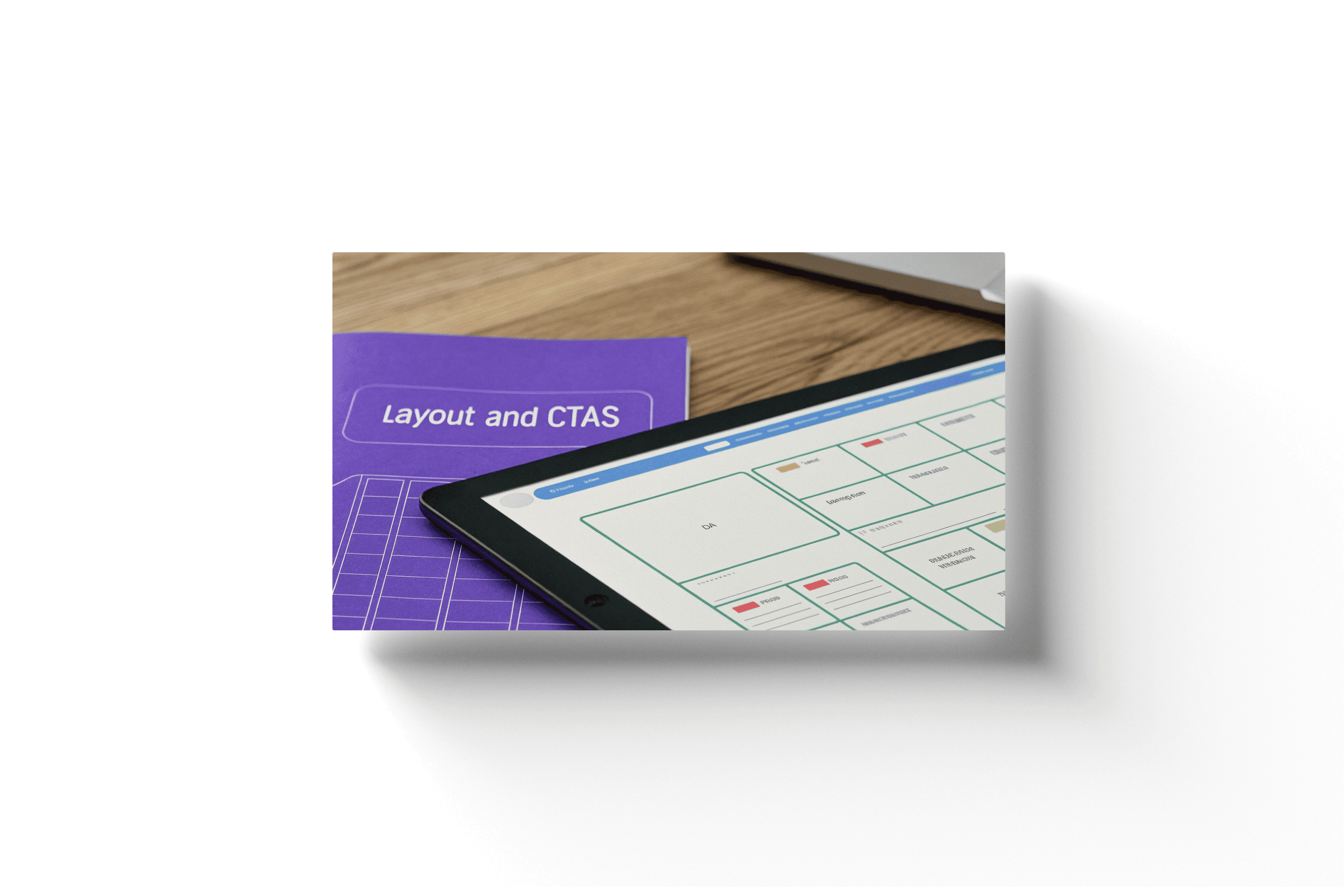
Calls to Action
Last but not least, every page needs a purpose. This is usually driven by the calls to action (CTAs). A "call to action" is an instruction to the audience designed to provoke an immediate response. In a wireframe, you'll see these marked as buttons or linked text designed to get a user to do something specific, like "Sign Up," "Learn More," or "Add to Cart."
Where you put these CTAs is a critical business decision. A wireframe helps pinpoint the most effective spots to place them for the best chance of conversion. At Nextus, getting the structure and placement of these key elements right is something we obsess over, ensuring our clients' websites don't just look good, but actually deliver results.

A Practical Guide to Modern Wireframing Tools
Picking the right wireframing software is like a mechanic choosing a tool from their toolbox; you wouldn't use a wrench to hammer a nail. The world of wireframing tools is vast, ranging from simple pen-and-paper sketches all the way to powerful, collaborative digital platforms. Each one is built for different needs, budgets, and skill levels.
The way these tools have changed over the years tells a bigger story about web design itself. Wireframes really became a necessity back in the late 1990s as websites started getting more and more complex. At first, designers had to make do with general-purpose software like Adobe Illustrator. But soon, specialized tools like Axure (which launched in 2003) and Balsamiq (launched in 2008) popped up, offering features made specifically for UI/UX work. This was also when responsive design started to take hold, forcing wireframes to become much more flexible than ever before.
From Simple Sketches to Digital Powerhouses
For just getting ideas out of your head, you really can't beat a good old-fashioned pen and paper. This is the ultimate low-fidelity method—it's fast, anyone can do it, and it forces you to focus purely on structure without getting distracted by fancy software features.
But when you're ready to bring those ideas to life digitally, dedicated tools give you a huge leg up. They come packed with pre-built components like buttons, forms, and menus, letting you assemble clean, professional-looking wireframes in a fraction of the time. Here are a few of the industry's go-to options:
Balsamiq is famous for its hand-drawn, sketchy look and feel. This is completely intentional. By making the design look unfinished, it encourages honest feedback on layout and functionality, not colors and fonts.
Sketch has been a rock-solid standard for years, particularly for designers on a Mac. It’s a powerful vector tool that’s perfect for creating high-fidelity wireframes that can later evolve directly into the final visual mockups.
Figma has absolutely taken over the design world, mainly because of its incredible real-time collaboration. It’s a true all-in-one platform where your team can go from the first rough wireframe to a fully interactive prototype, all inside a web browser.
Here’s a look at the Figma interface, which gives you a sense of its collaborative, component-based environment. This view really shows how designers can build libraries of reusable UI elements, which is a massive time-saver during the wireframing process.
Choosing the Right Tool for Your Project
So, which software should you choose? The answer really depends on your project's needs, how your team works, and what your budget looks like. A freelancer might love the straightforward simplicity of Balsamiq, while a big, remote team will get way more value out of Figma’s collaborative power. To help you make the right call, I've put together a quick comparison of some of the most popular options out there.
Top Wireframing Tools Compared
Balsamiq: Best for rapid, low-fidelity concepts. Its key feature is a sketchy, hand-drawn feel, and it's available via subscription or a one-time fee.
Figma: Best for collaborative team projects. Its key feature is real-time, browser-based editing, and it operates on a freemium/subscription model.
Sketch: Best for detailed, high-fidelity design. Its key feature is its robust vector editing tools, available via subscription.
At the end of the day, a good wireframe is all about clarity, not the complexity of the tool you used to build it. If you’re struggling to choose the right software or set up a solid wireframing process, our team at Nextus is here to help. We believe in building a strong structural foundation from the very beginning, a principle you can see in our examples of responsive web design.
How the Wireframing Process Evolved with the Web
Wireframing didn't just pop into existence one day; it grew up right alongside the internet. Looking back at its history really helps explain why understanding what a wireframe is in web design is so crucial now. It's not some passing trend—it's a practical solution born from decades of technological shifts.
Back in the early 1990s, the web was a simple, text-heavy world. The first browsers, like Mosaic which launched in 1993, were game-changers just for adding basic graphics. With only a few hundred websites online, design was pretty much just straightforward HTML layouts. There was no real need for a "wireframe" when your site was little more than text and hyperlinks.
To give you a sense of the explosion, the web went from just 623 websites in 1993 to over 10,000 only a year later. You can dive deeper into the historical development of web design on Wikipedia to see the full picture.
The Rise of Complexity Demands a Plan
Then came CSS for styling and JavaScript for interactivity, and suddenly websites got a whole lot more complex. Designers and developers needed a way to map out these dynamic, interactive layouts without getting lost in the weeds of code or polished visuals. This is the moment wireframing started to become an essential step.
You can see a clear path here, from basic documentation tools around 2003 to a bigger focus on user feedback by 2008, and then full-blown team collaboration by 2016. It's a perfect reflection of how our jobs have changed.
Adapting to the Modern Multi-Device Web
The final, massive shift happened in the 2010s with the mobile internet boom. The concept of responsive design changed everything. A website was no longer a single, fixed layout. It had to work perfectly on desktops, tablets, and smartphones.
Wireframes transformed from static blueprints for one screen into adaptive plans for countless devices. This evolution cemented their role as the essential strategic tool for creating user-centric experiences in a multi-device world.
This absolute necessity is what drove the development of the sophisticated, collaborative software we all rely on today. Here at Nextus, our entire approach to wireframing is built on this history—we know that a solid, flexible plan is the only way to build a digital experience that works for everyone, everywhere.
A Few Common Questions About Wireframing
Even after getting the basics down, a few specific questions always seem to pop up. Let's tackle some of the most common ones to clear up any lingering confusion about wireframes and how they fit into a web design project.
Think of this as your quick-reference guide. It covers the practical, day-to-day questions that give you the confidence to talk about, look at, and be a part of the wireframing stage of any project.
What Is the Difference Between Low-Fidelity and High-Fidelity Wireframes
The biggest difference here is the level of detail and what you're using them for. Low-fidelity wireframes are the back-of-the-napkin sketches. They're super basic, often just hand-drawn, and focus only on structure and layout. You'll see simple boxes and lines representing different elements, which makes them perfect for quick brainstorming sessions early on.
On the other hand, high-fidelity wireframes are much more polished digital mockups. They'll often include grayscale images, real-ish placeholder text, and sometimes even have clickable elements to show you how a user might move through the site. These come later in the process to iron out the user interface details before the visual designers take over, giving everyone a much clearer picture of how the final product will actually work.
Who Is Responsible for Creating Wireframes
Most of the time, a UX (User Experience) Designer is the one leading the charge on wireframes. It’s their job to get inside the user's head, understand the information architecture, and map out the most intuitive path through a website.
But that’s not a hard-and-fast rule. On smaller teams, you might see a UI Designer, a Product Manager, or even a web developer stepping in to create them.
The most important thing isn't the job title, but the person's deep understanding of the project's business goals and the target user's needs. Wireframing is a team sport, and the final version should always pull in feedback from the whole team and key stakeholders.
This collaborative vibe makes sure the blueprint works for everyone—from the developers who have to build it to the marketers who have to promote it.
Can I Skip the Wireframing Step to Save Time
It’s tempting, I get it. Jumping straight into the pretty visual design feels like a shortcut. But trust me, skipping the wireframing step almost always leads to massive headaches, delays, and budget blowouts later. It's the classic "pay a little now or pay a lot more later" scenario.
If you don't have a solid blueprint, you're just guessing. You risk ending up with a website that’s a jumbled mess, a user experience that makes people want to tear their hair out, and a huge gap between what your team thought they were building and what the client expected.
Fixing a major structural problem during the development phase is brutally expensive and time-consuming. Moving a few boxes around on a wireframe? That’s easy. Spending a little time upfront on wireframing is one of the smartest investments you can make to save a ton of time, money, and frustration down the road.
Wireframing has a huge and direct impact on your Search Engine Optimization (SEO). It sets up a rock-solid foundation for your site’s structure and user experience—two of the biggest things Google looks at.
This is your first, and best, chance to map out a logical information hierarchy and a navigation system that actually makes sense. When your site is organized clearly, it’s way easier for search engine crawlers to find, understand, and index all of your content.
Plus, by focusing on how users will move through the site and where key content will live, wireframes help you create a better overall user experience. That leads to good engagement signals, like lower bounce rates and people spending more time on your pages, which tells search engines your site is high-quality. This is where you decide where your H1 tags go, where important content blocks sit, and how your internal linking will work—all the nuts and bolts of a great on-page SEO strategy.
Navigating web design, from the first conversation to the final launch, means having a partner who gets how important a strong foundation is. At Nextus Digital Solutions, we build strategic wireframing into every project we touch to make sure your website isn't just beautiful, but also smart, functional, and built for growth. If you’re ready to create a digital presence that gets real results, we're here to make it happen. Discover our web design solutions and let’s build something amazing together.

2025
What Is Search Engine Optimization? A Practical Guide to Boosting Your Website Traffic
2025
What Is Search Engine Optimization? A Practical Guide to Boosting Your Website Traffic
2025
What Is Search Engine Optimization? A Practical Guide to Boosting Your Website Traffic

2025
A Practical Guide to Digital Marketing for Local Businesses
2025
A Practical Guide to Digital Marketing for Local Businesses
2025
A Practical Guide to Digital Marketing for Local Businesses
Frequently
Frequently
Asked Questions
Questions
Asked QuestionS
What services do you offer as a branding agency?
What industries do you specialize in?
How Does Pricing Work?
Can you provide examples of your previous work?
How do you approach Client branding projects?
What's the best way to learn more or work together?
What services do you offer as a branding agency?
What industries do you specialize in?
How Does Pricing Work?
Can you provide examples of your previous work?
How do you approach Client branding projects?
What's the best way to learn more or work together?
What services do you offer as a branding agency?
What industries do you specialize in?
How Does Pricing Work?
Can you provide examples of your previous work?
How do you approach Client branding projects?
What's the best way to learn more or work together?
FREE AUDIT?